Design Spotlight: The New SFMOMA
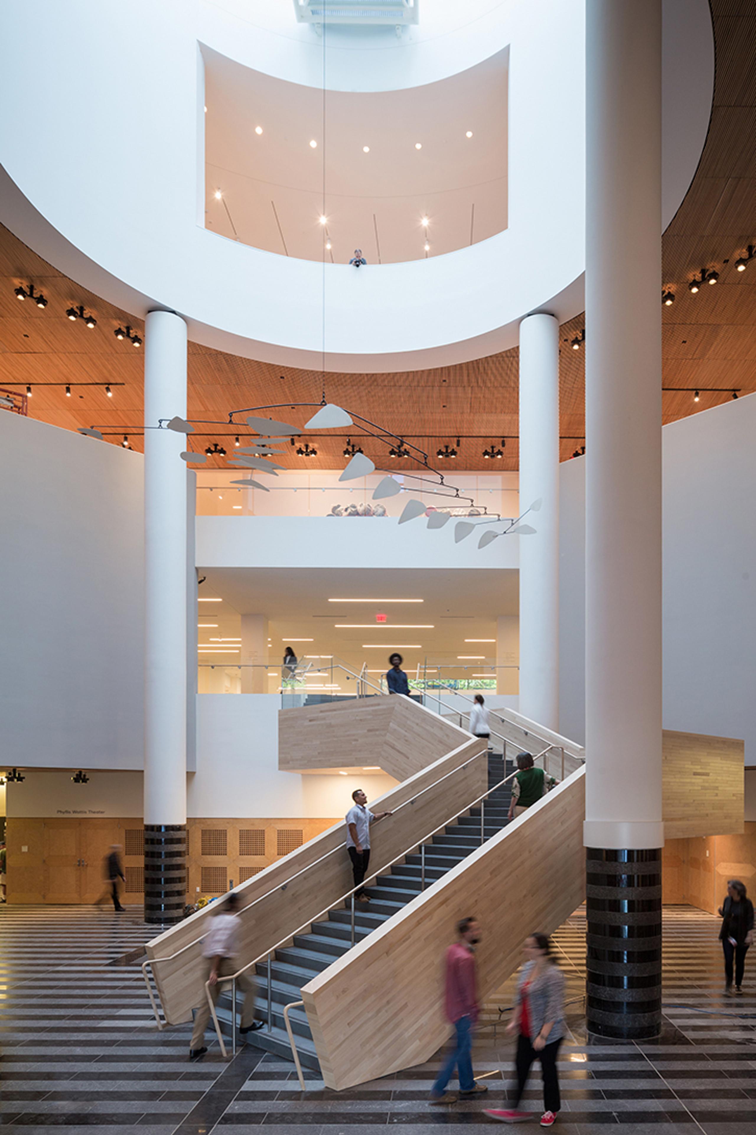
We at AETHER are fans of good, clean design—both in our clothes and in architecture, which is precisely why we were excited to see the new SFMOMA recently unveiled after three years of renovation. Designed in collaboration with Norwegian architecture firm Snøhetta, the 225,000-square-foot expansion has more than doubled the museum’s exhibition space, while still maintaining cohesion with the original Mario Botta-designed building. With the addition of this new space, SFMOMA now comprises 10 floors and is the largest modern and contemporary art museum in the United States.
In 2009, the museum negotiated a partnership with Gap founders and major contemporary-art collectors Doris and Donald Fisher to house the couple’s massive private collection of more than 1,000 pieces for the time period of at least 100 years, spurring the institution to launch the major expansion to accommodate the works. The opening initially brings 260 pieces from the renowned collection to the public, which come in addition to the museum’s monumental permanent collection and hundreds of new pieces donated by regional collectors. The thousands of artworks on view comprise 19 different exhibitions, ranging from photography and film to painting and sculpture.
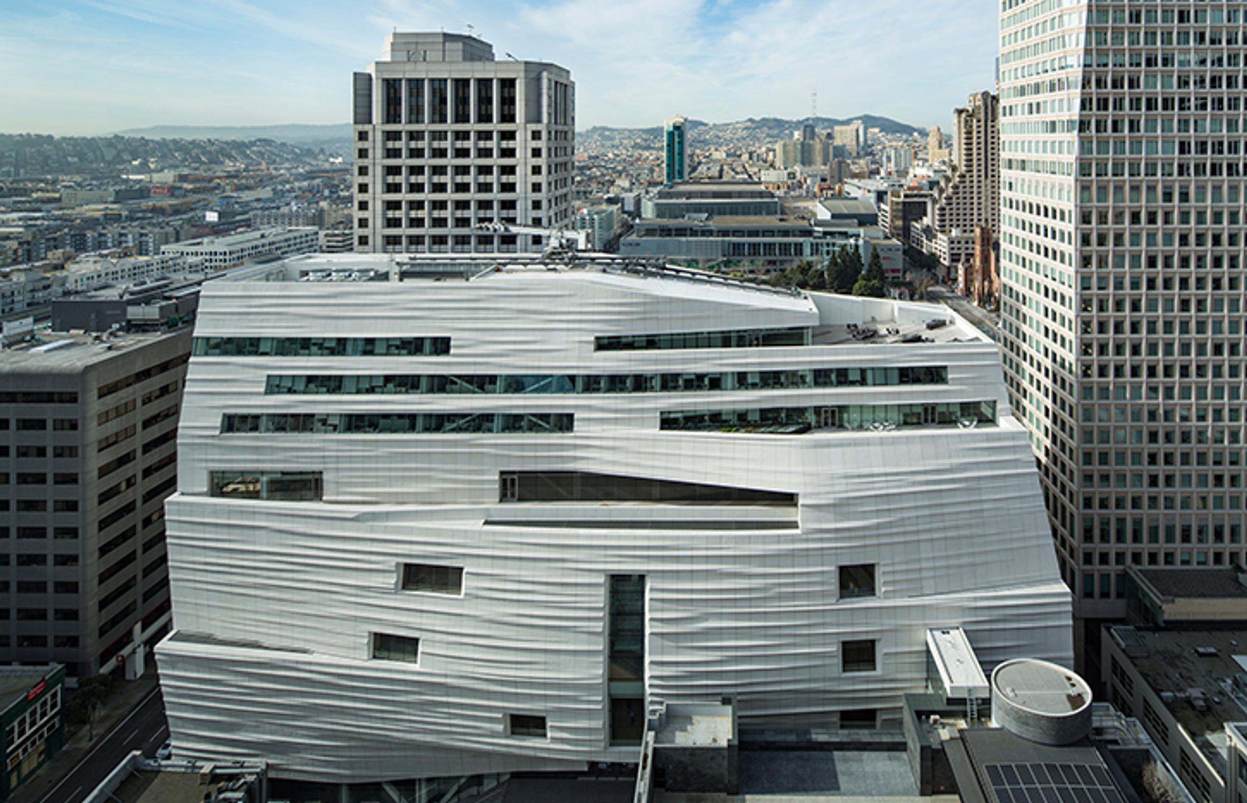
While countless priceless works of art exist within the walls of the new building, the exterior is something to experience as well: The building's new eastern façade was inspired by the water and fog of the San Francisco Bay, each day’s shifting light and shadows naturally animating the wave-like design. If you can’t make it to San Francisco to see it for yourself, check out this virtual tour of the new SFMOMA, courtesy of Wired and more photos of the stunning new building below.
Photos via ArchDaily.


